Submitted by sam on Sat, 07/29/2006 - 20:39.
I mentioned it before, but I am very close to having the FFXI ClanAM website updated. I've mapped out the software update, and it seems to be pretty smooth (with a few exceptions listed below). The last thing that has remained is the theme migration.
Well, I think the theme is pretty well done. Read on for some sample images from the upcoming site update, as well as an overview of a few of the new features...
Software Update
We will be updating to the latest version of Drupal. We have been running Drupal for the last 3 years on this site, however, I've just been patching for security and not performing full version updates (for fear of breaking things).
In my tests, the software upgrade has gone well. Right now, there are 2 known issues with the upgrade:
- Deleted posts reappear : For some strange reason, during the upgrade some deleted posts come back.
- Moved images "un-move" : This is probably related to the deleted posts problem, but images that have been moved between galleries reappear in their original galleries.
Because of these two known issues, I was wondering if I could ask for some volunteers who would be willing to help me go back and 'prune' previously deleted posts after the upgrade but before the site goes live. Basically, I need some people who already have forum admin access to help me ensure that any blatantly obvious deleted posts stay deleted.
Additionally, I will need some gallery admins to volunteer to help me ensure that the new galleries remain the same as the old ones.
For those volunteering, I will keep the old site up temporarily at a staging domain for reference.
New Theme
Contrary to popular belief, I have actually updated the theme to the ClanAM site four times since the site first went online. However, none of the previous theme "tweaks" have been as radically different as this new theme for the site update. Many of the new theme elements are actually designed to better utilize some of the new features in the latest version of Drupal. To show you the differences, I have prepared some before and after shots of the site.
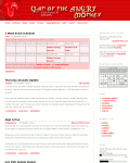
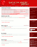
This first comparision is of the main page. On the left is the way the current main page looks. On the right we have the updated theme.
Old theme, Main page |
New theme, Main page |
The first thing you'll probably notice is the right column blocks are now themed a bit darker than they were before. I've tried to keep the same basic elements from the current theme (as I feel it works well), but I have attempted to update those things that needed updating.
Forums
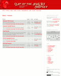
Next, let's take a look at the forum page. As you can see, the new version of Drupal can actually give you "last post" dates in a more "human friendly" format ("2 weeks ago" as opposed to "07/14/2006").
Old theme, Forums |
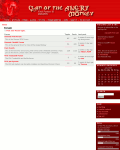
New theme, Forums |
The first big improvement you will notice over the current version of Drupal we're running is that there are a lot more options available whenever you want to post anything. Once again, on the left is the old site, and on the right is the new site.
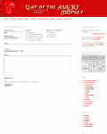
Old theme |
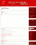
New theme |
As for the comments themselves, I've personally always had a problem with how easily the comment threads can blend together making following complicated threads (like the pudding one, for example) difficult. With the new set up, I've tried to really make the individual posts stand out. On the left, you can see a typical forum thread using the old theme. On the right, you can see the same thread using the new theme. I personally think it's an improvement.
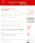
Old theme |
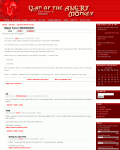
New theme |
Image Galleries
Another problem I always had with the current way the site was set up was that the image galleries didn't handle arbitrarily sized descriptions and titles cleanly. Long titles or descriptions could always easily break the page. The new gallery code is more dynamic, and flexible, as you can see in the following comparison. Once again, old theme is on the left, the new theme is on the right.
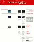
Old theme |
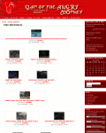
New theme |
Guides/Books
The guide/book feature of Drupal is, without a doubt, the most useful thing to us. Having the ability to create complex and detailed guides for FFXI easily is very important to ClanAM.
However, navigating these guides/books has always been difficult. Thus, in the site update we will be utilizing a dynamic "Table of Contents" navigation block that will only appear inside guides and books. Here is a sample "Table of Contents" from Cyc's excellent Assault book.
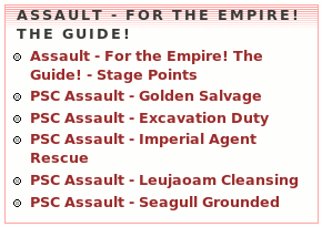
Sample Table of Contents
Here is an example page showing where the "Table of Contents" navigation block will go. On the left is a guide/book as it appears in the old theme. On the right is the same guide/book in the new theme with the "Table of Contents" navigation block.
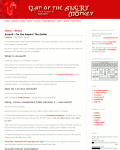
Old theme |
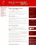
New theme |
Search Features
Another problem I've always had with the old Drupal is that it's search was rather simple. The new Drupal, however, has a much more featureful search functionality. One of the first things you'll notice when you use the new site is that there is always a simple search function on every page.

Search box
When you want a more advanced search, you will be able to simply select the "Search" option from the main menu. On the left is the old site search, while on the right is the new one.
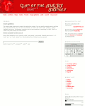
Old theme |
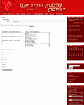
New theme |
Polls
The polls will remain largely the same, however, they will inherit a lot of the same functionality as the forum updates have.
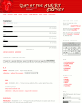
Old theme |
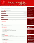
New theme |
When will it be?
Well, I hope you're as excited about this update as I am. I've put a lot of effort into it thus far, and it's about 90% ready to go.
Right now I'm expecting to put the new update into place early next week. If you are one of the various admins on this site and would like to help me out with the two problems mentioned above, please contact me in the game. Otherwise, if you have any questions or comments on this update, feel free to post them here.
Thanks, folks.


![[ Home ]](http://ffxi.clanam.org/themes/clanam/images/home-off.png)

![[ Archives ]](http://ffxi.clanam.org/themes/clanam/images/archives-off.png)

![[ Blogs ]](http://ffxi.clanam.org/themes/clanam/images/blogs-off.png)

![[ Guides ]](http://ffxi.clanam.org/themes/clanam/images/guides-off.png)

![[ Forums ]](http://ffxi.clanam.org/themes/clanam/images/forums-off.png)

![[ Image Galleries ]](http://ffxi.clanam.org/themes/clanam/images/image-off.png)

![[ Older Polls ]](http://ffxi.clanam.org/themes/clanam/images/polls-off.png)

![[ Advanced Search ]](http://ffxi.clanam.org/themes/clanam/images/barsearch-off.png)

![[ My Account ]](http://ffxi.clanam.org/themes/clanam/images/my_account-off.png)


![[ Home ]](http://ffxi.clanam.org/themes/clanam/images/home-off.png)

![[ Archives ]](http://ffxi.clanam.org/themes/clanam/images/archives-off.png)

![[ Blogs ]](http://ffxi.clanam.org/themes/clanam/images/blogs-off.png)

![[ Guides ]](http://ffxi.clanam.org/themes/clanam/images/guides-off.png)

![[ Forums ]](http://ffxi.clanam.org/themes/clanam/images/forums-off.png)

![[ Image Galleries ]](http://ffxi.clanam.org/themes/clanam/images/image-off.png)

![[ Older Polls ]](http://ffxi.clanam.org/themes/clanam/images/polls-off.png)

![[ Advanced Search ]](http://ffxi.clanam.org/themes/clanam/images/barsearch-off.png)

![[ My Account ]](http://ffxi.clanam.org/themes/clanam/images/my_account-off.png)


Thank you
Thank you, everyone, for the nice things you said.
Honestly, if it weren't for my friends in this game, I probably would have quit long ago (dealing with the "random idiots" you tend to find in this game makes me want to scream).
Vis Maior's Journeys
http://maior.samhart.net/
Maior
Count me in to breeze through the forums and "remove" certain content. I'm working at the universities help desk as of late and frankly my day consists mostly of tooling around the web, it'll give me something more worth while to do.
The Update looks pretty good so far, hopefully the transition is smooth.
Some goal i set for this site:
-> finish the Brenner guide
-> publish the Craftsman super guide. (working on it at work, it will be published complete rather than, incomplete like the brenner guide)
Hey can we remove I'm going Japanese now :P
weee
ahhhh very nice, gj mai
Great job & thank you
I just wanted to be the first one to say ouve done a great job with the site design. Ive been in irc and have even helped you diagnose problems with the test upgrade and i don't think most people in this clan relly reallize just how much you work you put into everything for us. For the last 2 weeks youve been working on this upgrade. Youve easily put in enough effort for it to be a full time job.
Anyway i wanted to thank you for all the work youve put into this clan for the last 3 years. It really doesnt get said enough, but if it weren't for you, most of us wouldnt be where we are.
I wouldnt have my Optical Hat if not for you, and I certainly wouldn't have made it past my dragon fight without your monk.
Youve managed this site for 3 years and paid for the bandwitdh we suck up ($90 bajillion dollars per month lol).
So even if no one else will, i wanted to thank you for all youve done for the clan^^
RavenclawX/Ranger

yeah what he said !!!
see above comment!! Great job Maior.. er Sam.. er whatever ^^